See You Later Café & Bakery
Graphic Design | UI/UX Design
Overview 📍
This was an academic project started during a graphic design course and further evolved as a UI/UX project during a new media course at BCIT. The goal was to brand a a local family-run business, mock-up branded packaging, as well as work through the processes of designing a mobile app.
Tools Used ⚙️
- Illustrator
- Photoshop
- InDesign
- Figma
- Maze
Part I: Branding
Concept
See You Later Café & Bakery is a charming family-run café & bakery that offers fresh pastries, drinks, and a cozy place to chat. Connection, friendly, charming, and cute, were keywords identified to embody the brand. Individuals with a middle-class income, target age range of 15-40, and desire to support local were identified as the target audience.
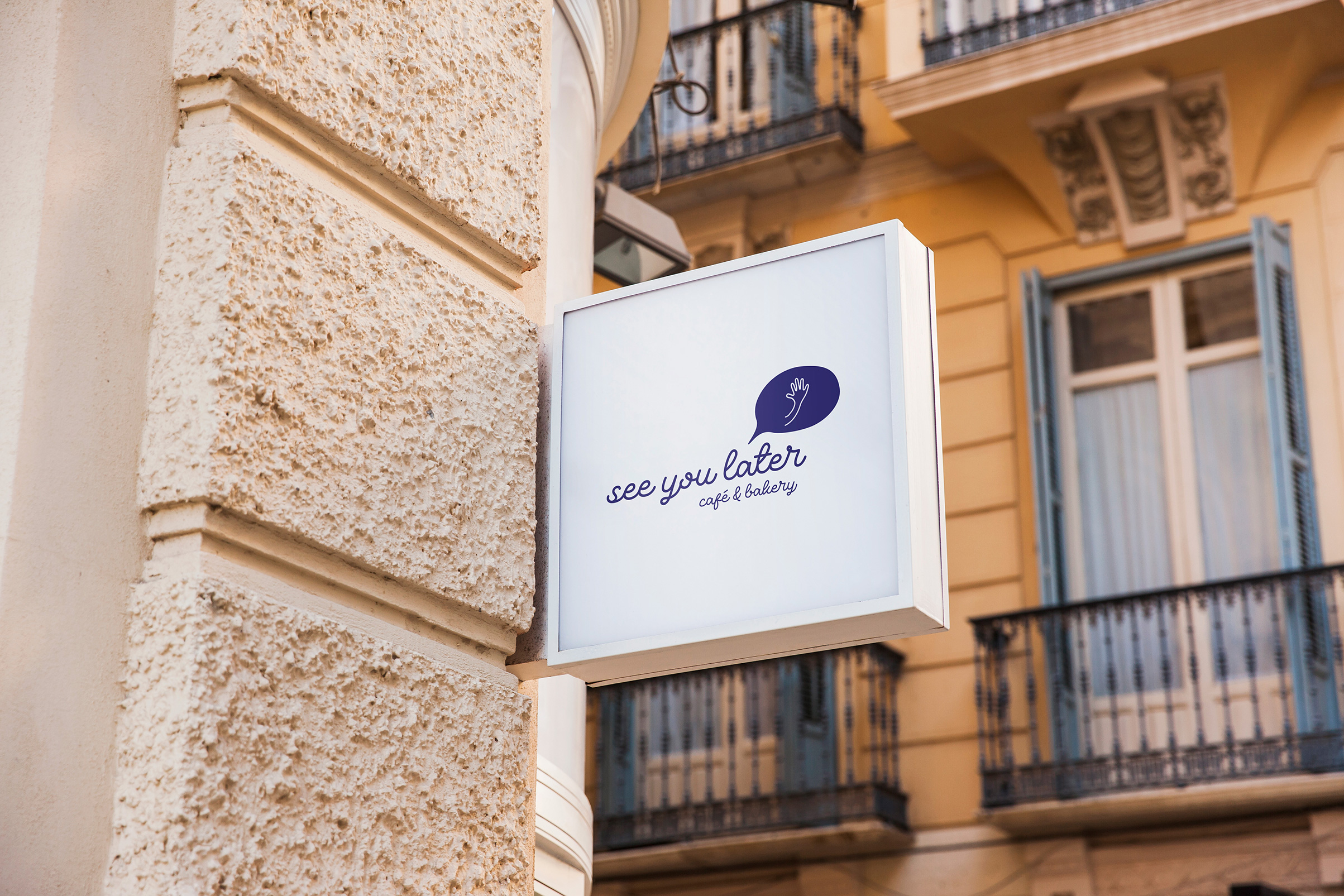
Logo
The logo represents the friendly relationship between See You Later and its customers. The waving hand within the speech bubble illustrates the name of the establishment itself, as the welcoming atmosphere will naturally attract returning customers. A hand-drawn style font was chosen to match the cute and charming business.
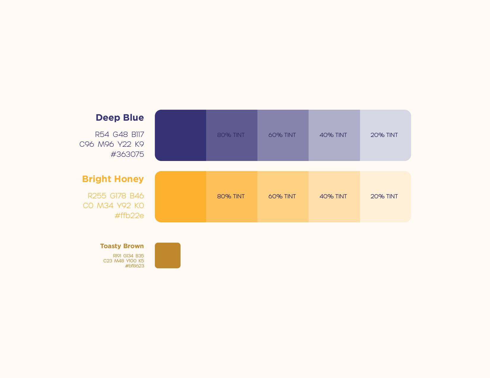
Colours
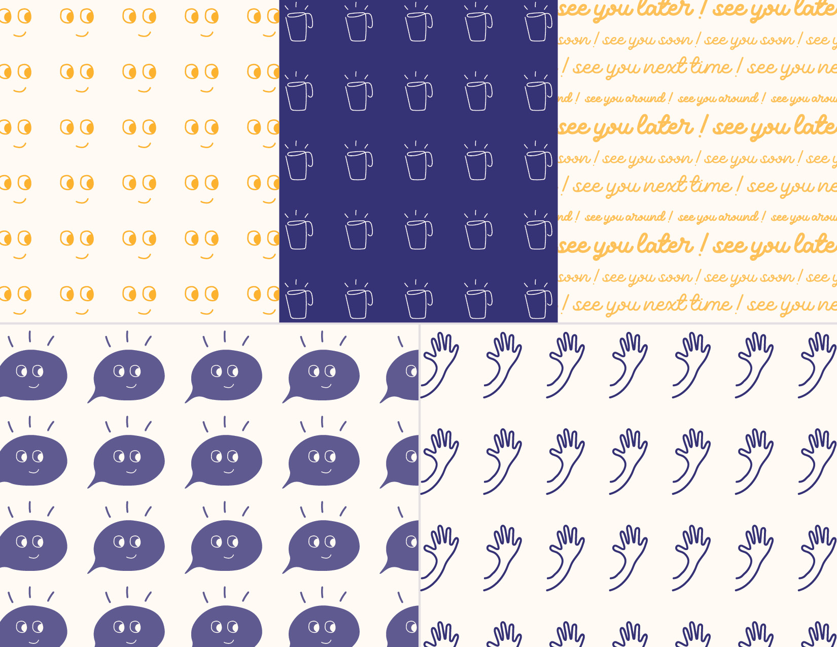
The primary brand colours are composed of a warm-cool colour combination. The deep blue colour signifies the trust and reliability that customers can expect from the family business. The bright honey colour represents the warm hospitality and energy that customers will feel when visiting. The secondary toasty brown colour is a shade derived from the bright honey colour, used for text legibility on the branded packaging.
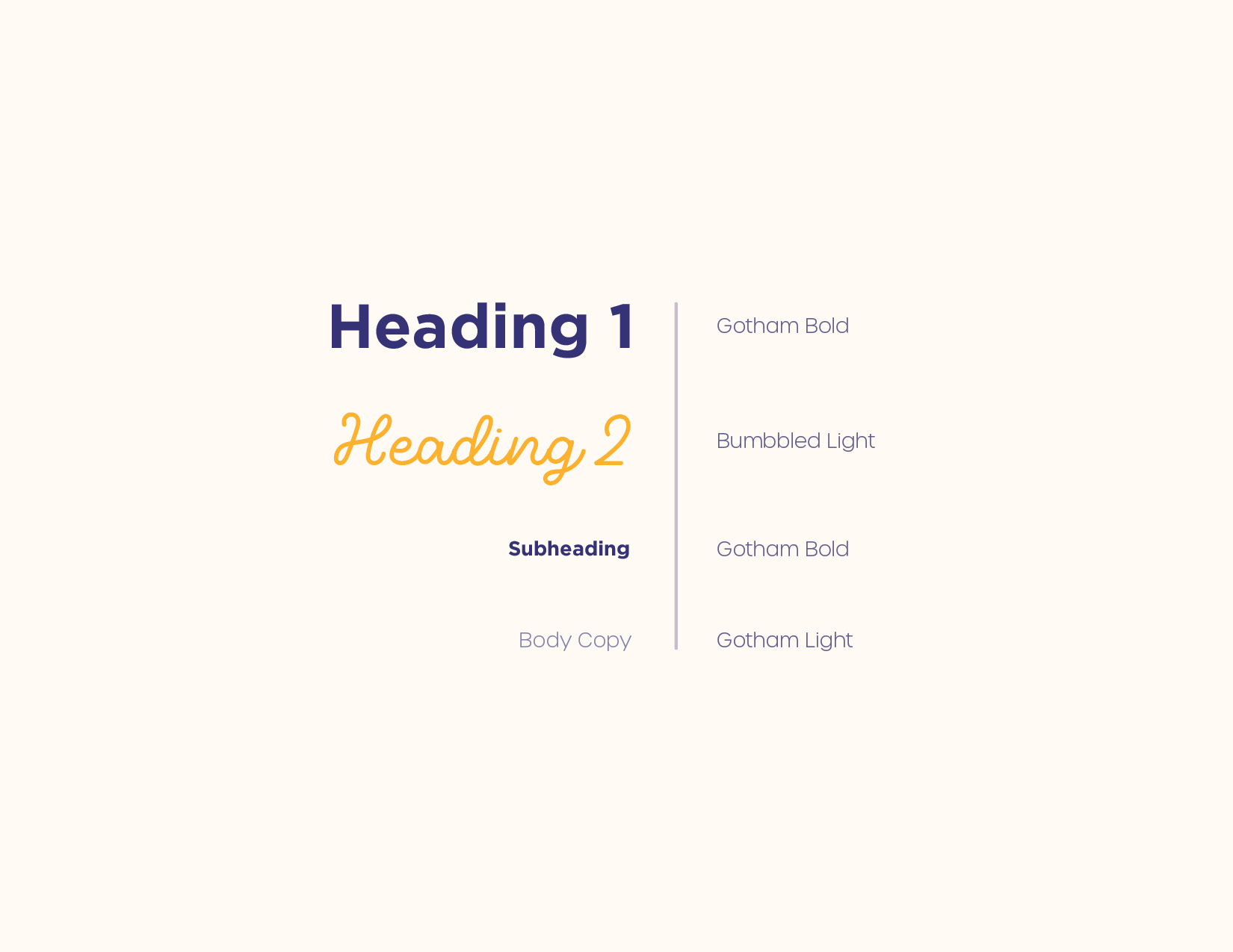
Typography
A cute rounded script font was chosen for headings to convey friendliness and hospitality. A clean, sans-serif font was also chosen to provide contrast and legibility for the text. Together they pair together to represent a local brand that is approachable and accessible to its audience.
Part II: Packaging Design
Packaging Creation
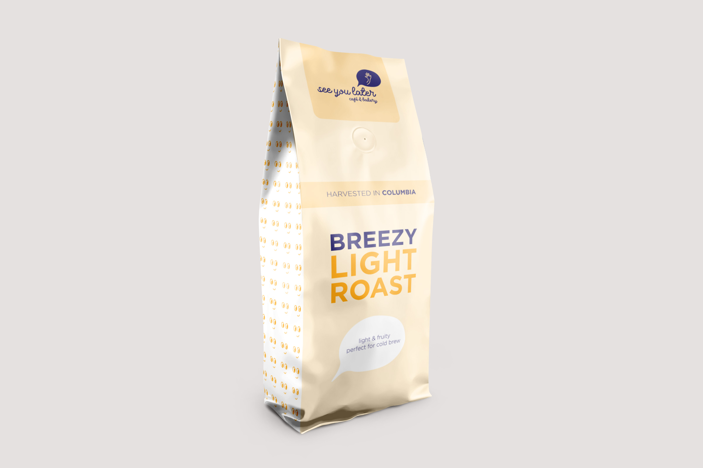
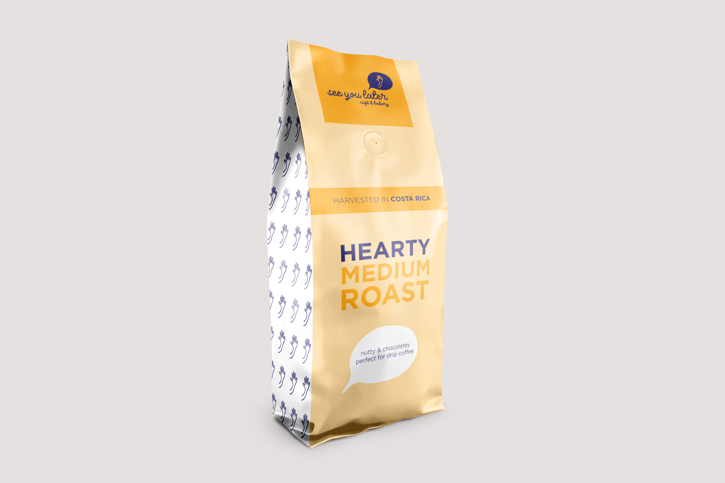
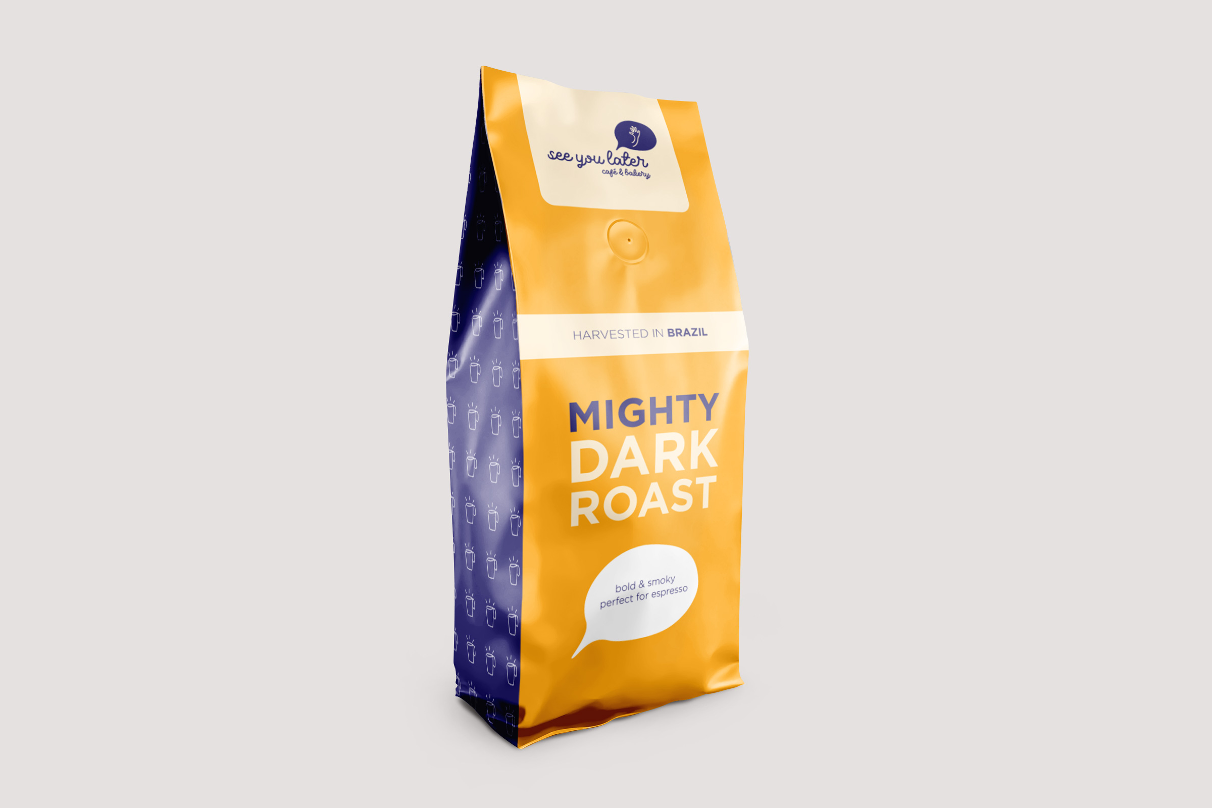
Keeping with the fun and playful mood of the brand, fun illustrated patterns made in Illustrator were incorporated into the packaging. A Photoshop template was used to transfer the 2D Illustrator files onto 3D mockups. Three different coffee roasts & two delicious tea flavours were created.
Breezy Light Roast
- A light & fruity roast perfect for cold brew
- Harvested in Columbia
Hearty Medium Roast
- A nutty & chocolatey roast perfect for drip coffee
- Harvested in Costa Rica
Mighty Dark Roast
- A bold & smoky roast perfect for espresso
- Harvested in Brazil
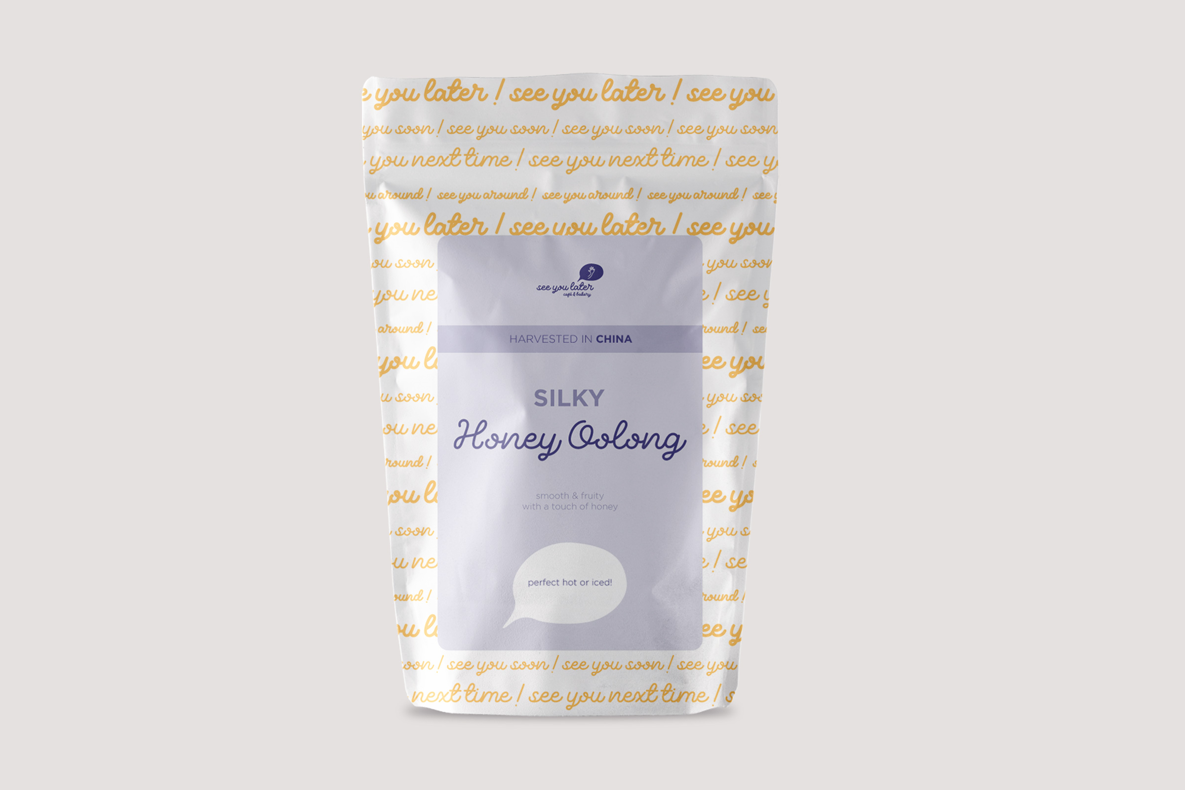
Silky Honey Oolong
- A smooth & fruity oolong tea with a touch of honey
- Harvested in China
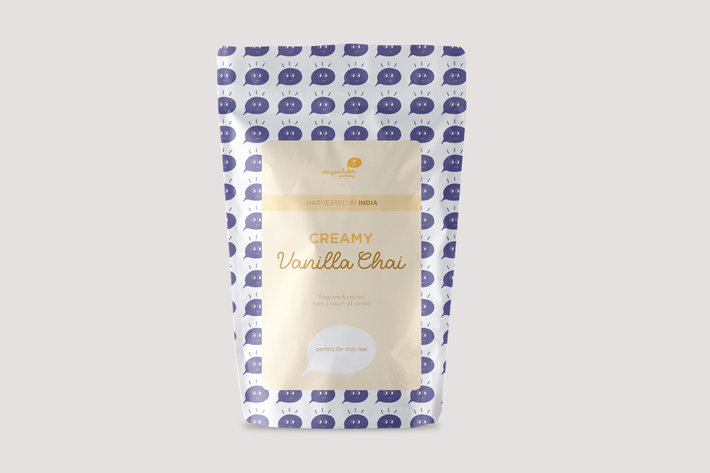
Creamy Vanilla Chai
- A fragrant & spiced black tea with a touch of vanilla
- Harvested in India
Part III: Mobile App Prototype
Analyze: Empathize
A user persona, user scenario, and user flow were created to empathize with an audience that would have a need for the mobile app. The scenario was based on a local coffee drinker who wants to purchase coffee beans from the shop virtually, and a user flow was included to map out the steps required for the process.
view details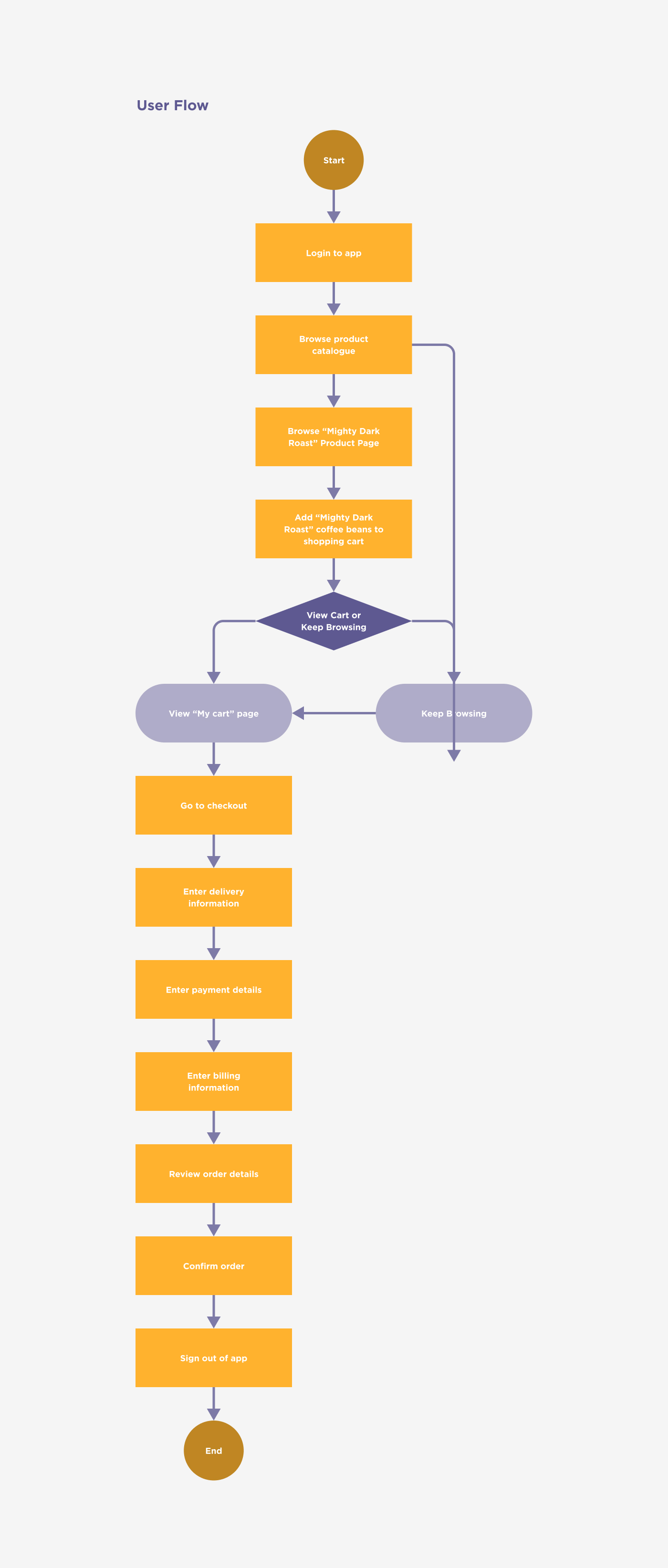
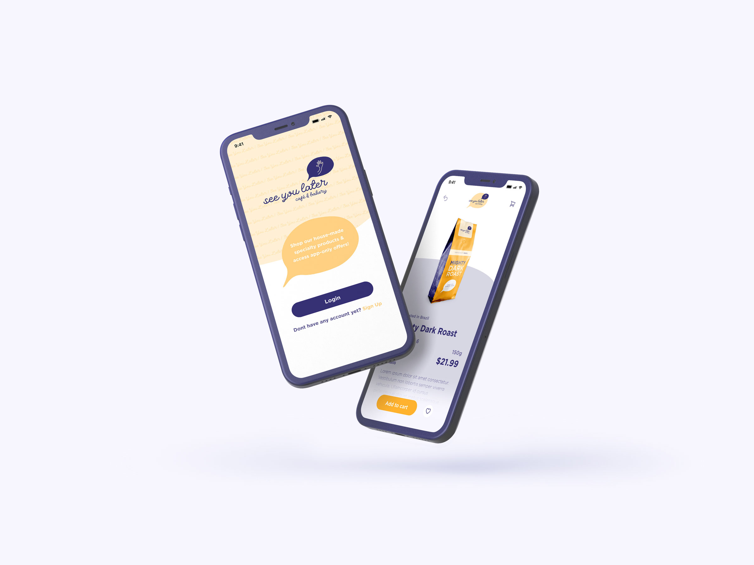
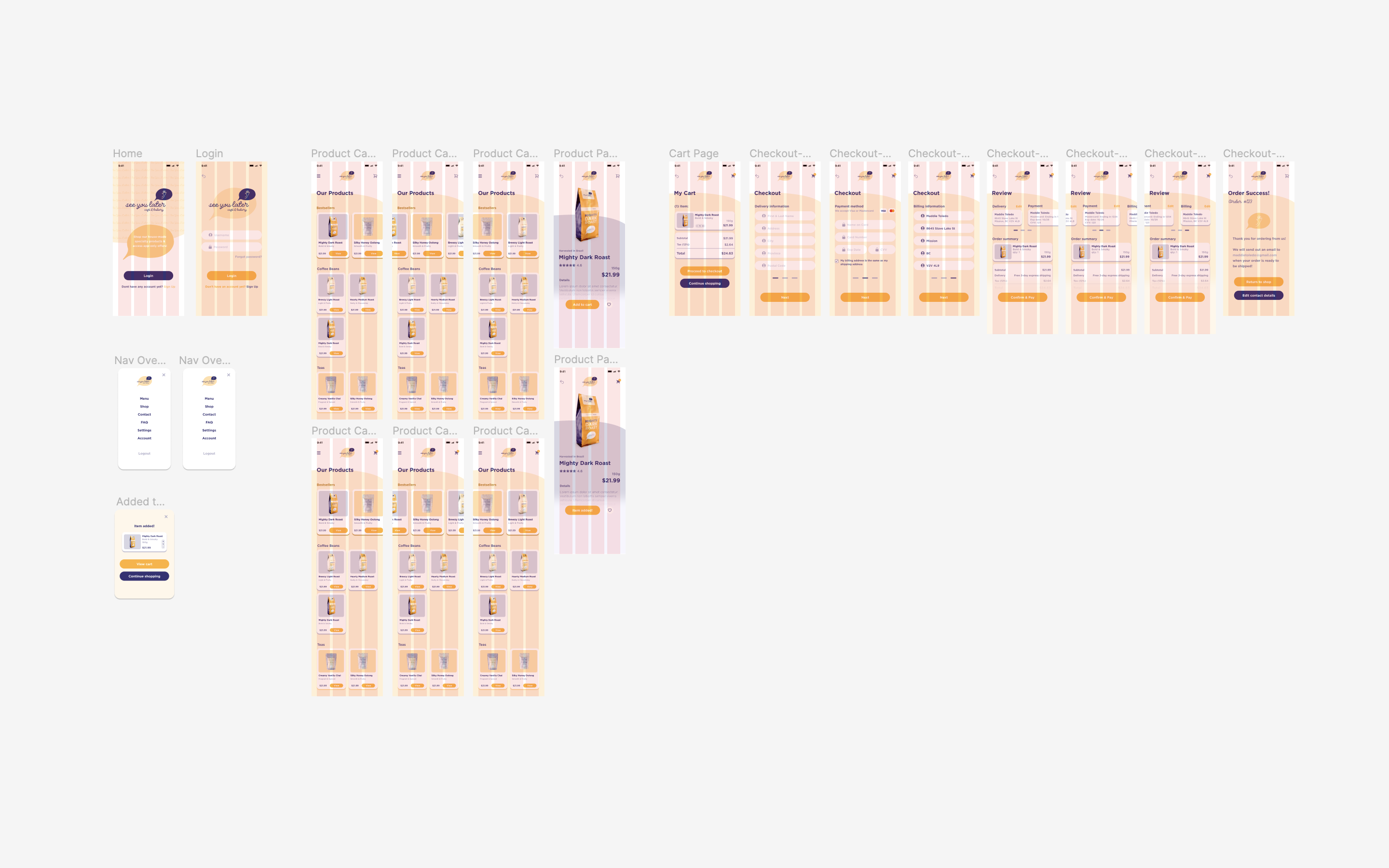
Design: Ideate + Prototype
The visual identities for the brand were used when creating the mobile prototype in Figma. The packaging mockups were incorporated into the design as the products. The prototype was designed using a 4-column grid, and an emphasis was placed on creating a clean, simple, and fun interface.
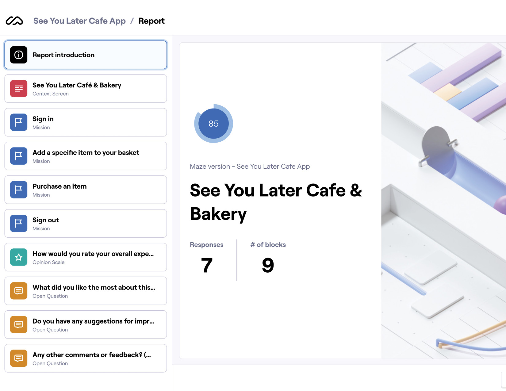
Evaluate: Test
Unmoderated user testing was completed using Maze, in order to identify usability problems and determine the overall user satisfaction for the mobile app.
The test was sent out to 8 participants, and consisted of 4 tasks that answered 3 key questions, including whether users were able to:
- Successfully login to the app
- Find and purchase a product, and
- Logout of the app
Evaluate: Assess
Four main pain points were then identified from the testing statistics, user heatmaps, and user responses to post-test questions:
- Pain Point 1 - Login/Signup button hierarchy
- Pain Point 2 - Missing item quantity
- Pain Point 3 - Confirm & Pay button positioning
- Pain Point 4 - Checkout process legibility
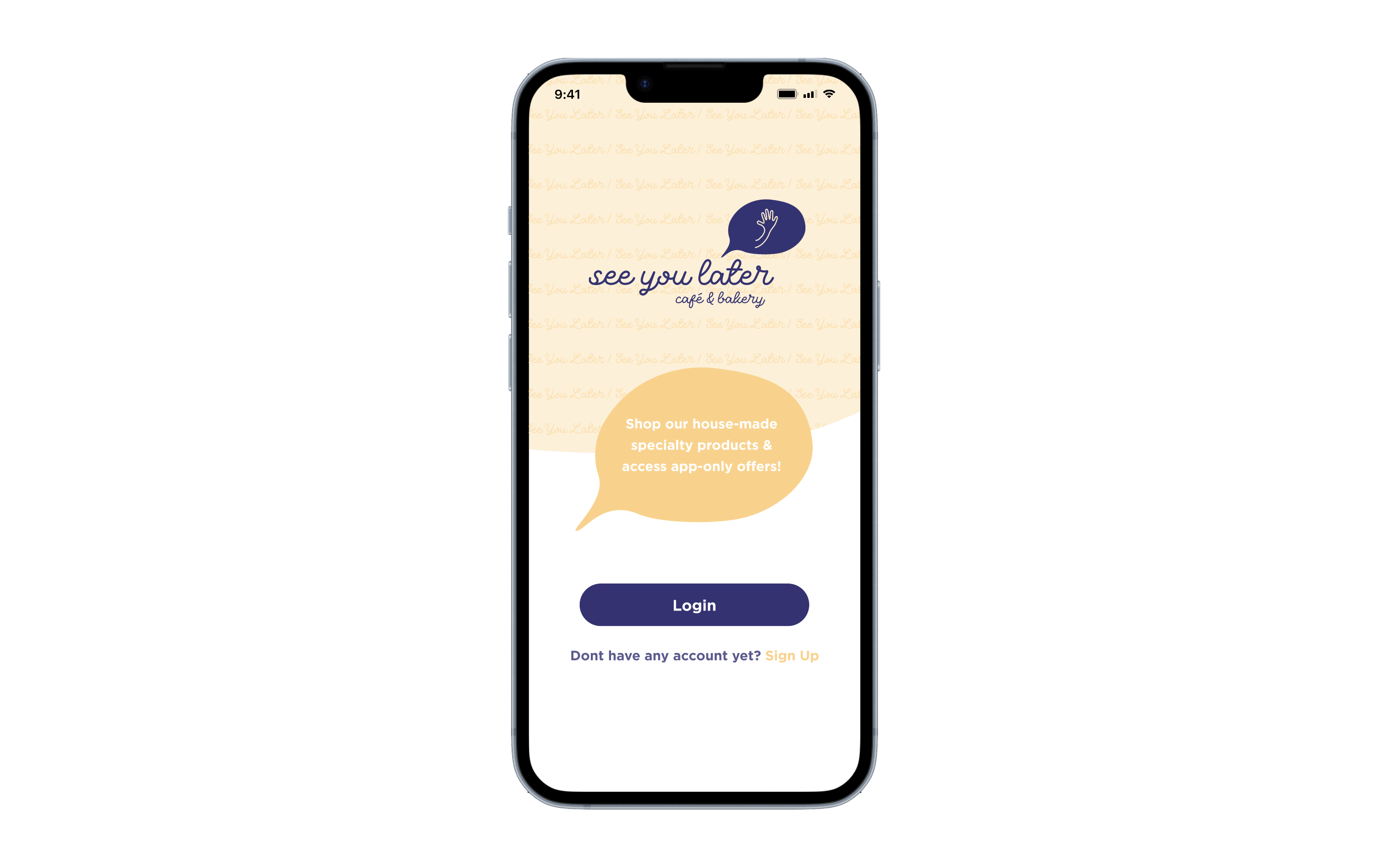
Implement
Based on the identified pain points, adjustments were made to the login/signup screen, the product page, and the checkout process to improve the user experience.
Final Steps
A final usability testing report was created using InDesign to detail the user testing process and findings. A Photoshop template was also used to mockup the prototype on a phone screen.