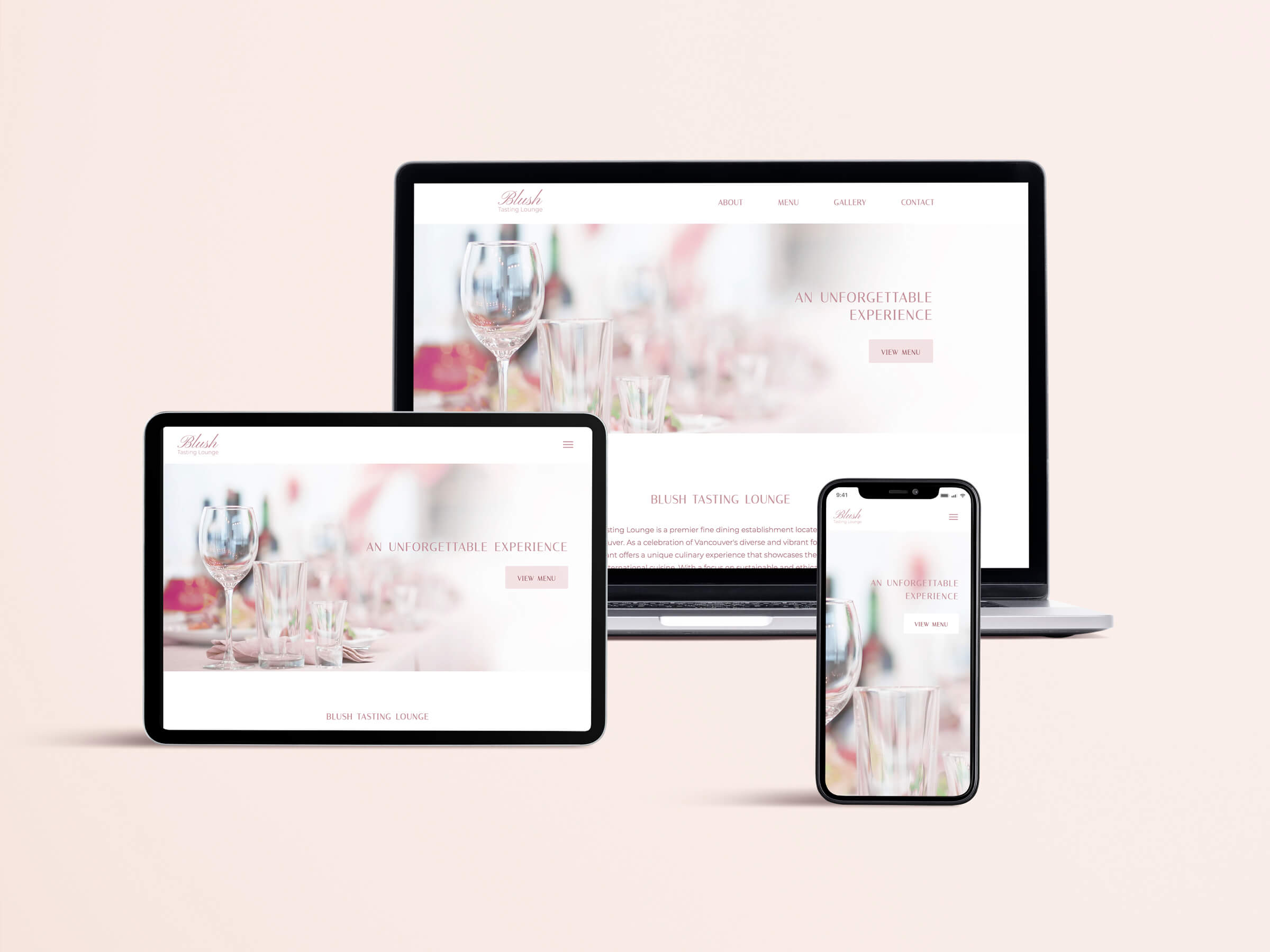
Blush Tasting Lounge
Responsive Web Design
Overview 📍
This was an academic project created for a web development course at BCIT. The goal was to create a single-page responsive website for a local restaurant, showcasing the ability to both design and develop a website. Made with HTML, CSS Grid & Flexbox, and a bit of JavaScript.
Tools Used ⚙️
- HTML
- CSS
- JavaScript
- Figma
- Photoshop
Concept Development
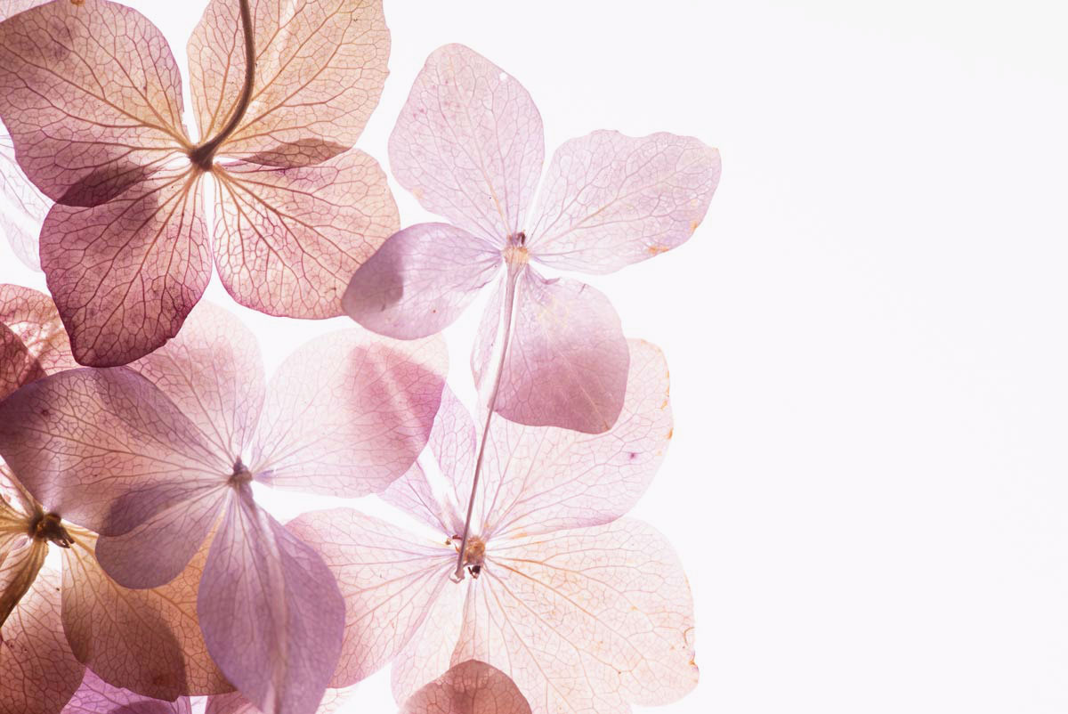
Blush Tasting Lounge was inspired by the atmosphre of luxury and elegance associated with fine dining. Inspiration for the brand was drawn from an image of hydrangea flowers that I found on Adobe Stock, and the flowers also acted as the reference for the colour palette of the website. An elegant serif font was also chosen to complement the sophisticated feel of the brand.
Prototype Creation
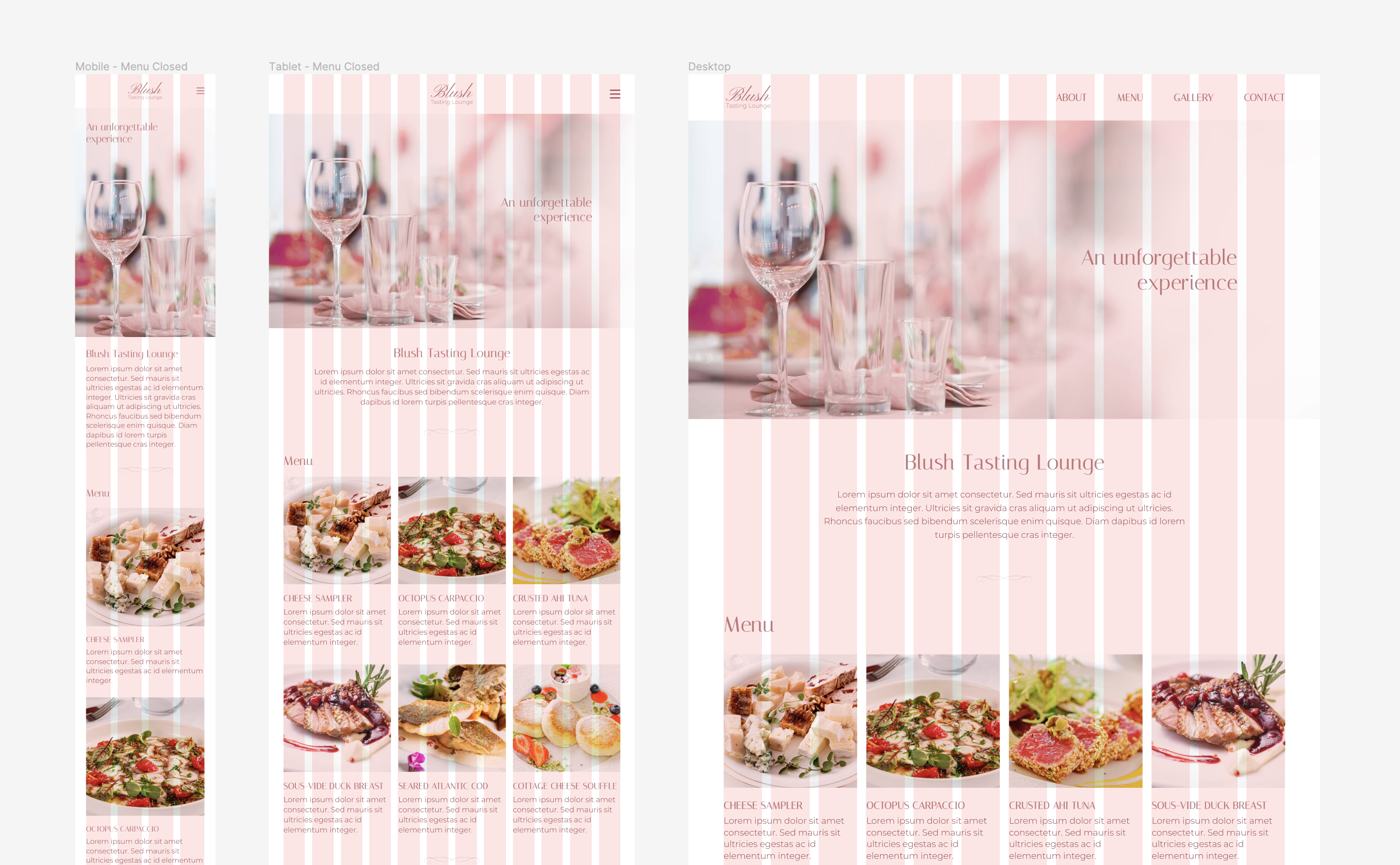
Figma was used to build the prototype for the website. Three separate frames were created in order to display the mobile, tablet, and desktop views. The mobile frame was designed on a 4-column grid, while the tablet and desktop frames were designed using a 12-column grid. Using multiples of 4 allowed the layout to scale easily between the viewports.
A mobile-first design approach was followed to prioritize the core sections on the website, and a nav menu overlay was added for the mobile and tablet frames.
After submitting the initial Figma design, the prototype was revised to improve legibility; this included changes such as increasing the line height and section spacing in the desktop view, as well as increasing the overall body font size.
Website Development
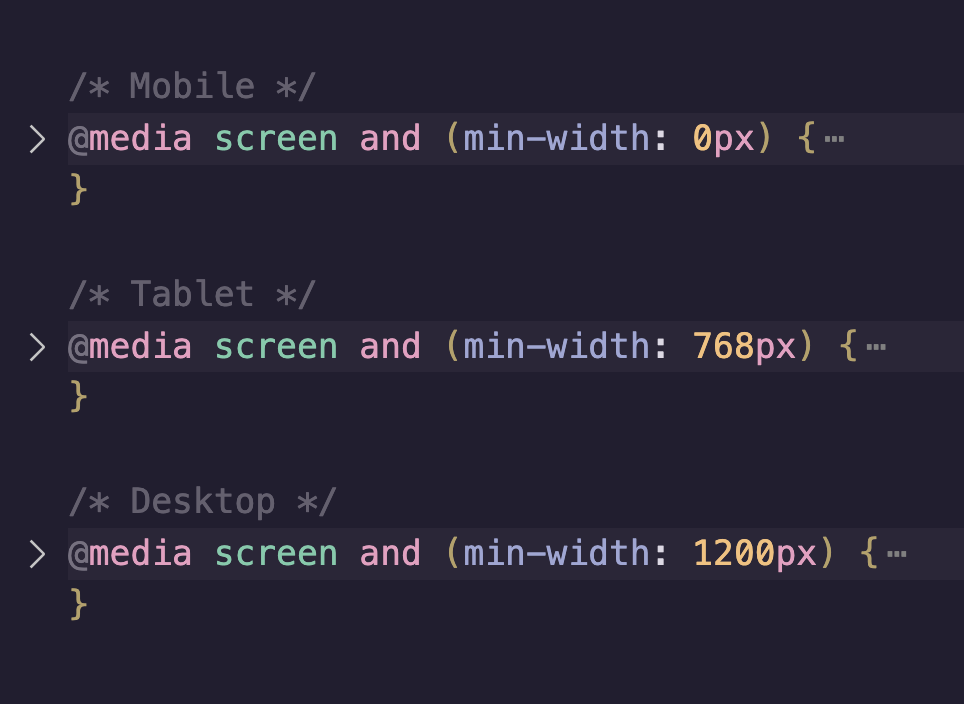
The HTML structure was organized to ensure each section's content would be wrapped in a grid to keep the layout organized. Three separate media queries were used for each of the 3 device sizes: the mobile media query was given a min-width: 0px; , tablet a min-width: 768px; , and desktop a min-width: 1200px.
Once the typography and other visual elements were styled in accordance with the Figma design, I added the Fullscreen Lightbox plugin so that viewers would be able to zoom into the gallery images for a closer look.
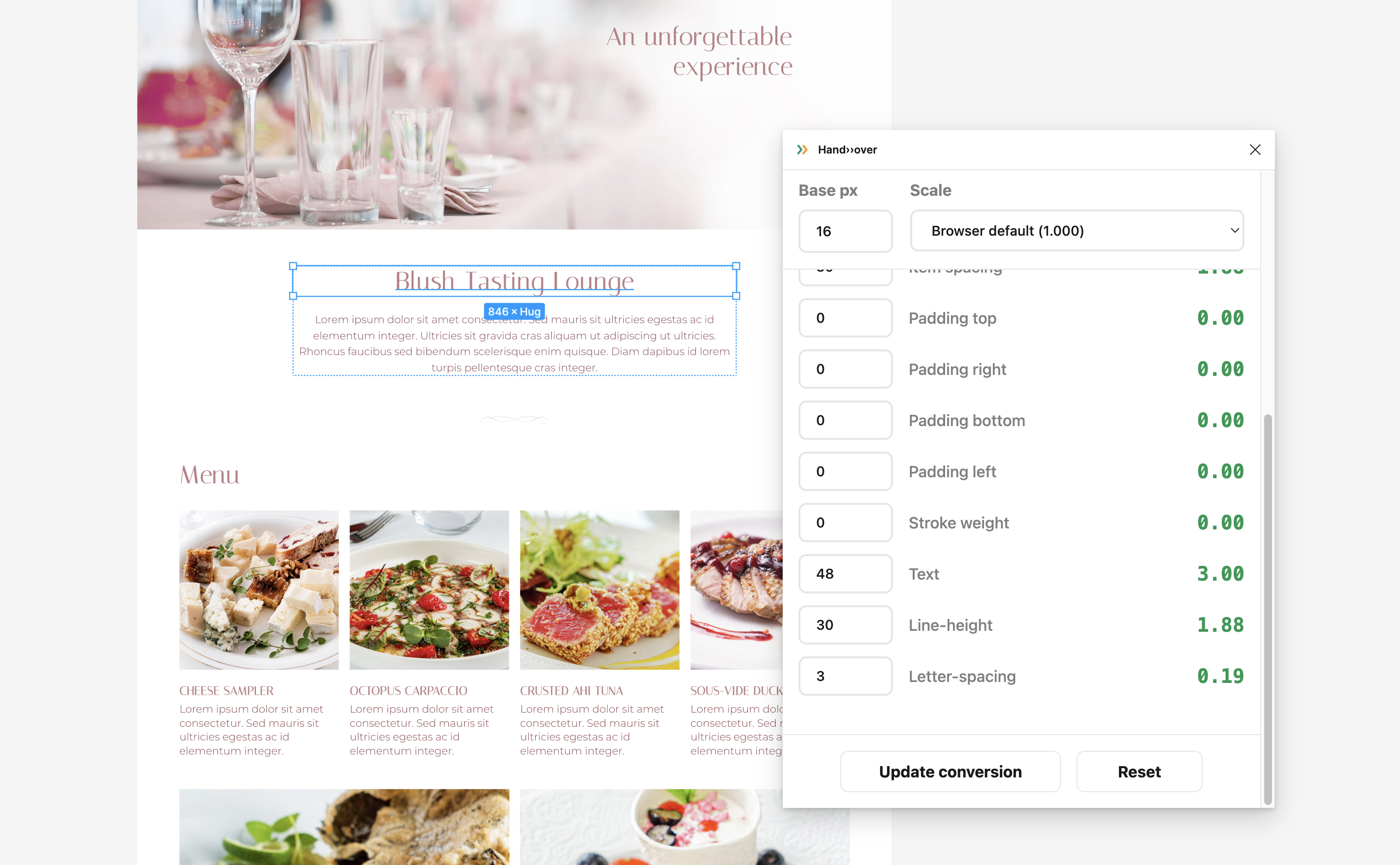
Challenge: Design Handoff
A challenge I ran into during the process was figuring out how to convert between the pixel values used in the Figma document, to the rem units which I was using in CSS. Initially I was converting between the units by searching the values up in Google, however I quickly realized that it was inefficient to do them one by one. I ended up finding a Figma plugin called Hand>>over which was able to convert values upon selecting the specific layers in Figma, which helped with the process. This project definitely opened my eyes to one of many potential challenges that can come up during handoff from design to development.
Final Steps
A Photoshop template was used to visually display the 3 different screen sizes I had developed for. And with the help of YouTube and GitHub Docs, I learned how to deploy a project with GitHub Pages for the first time.